Case study: Laurel Avenue Residence
Site Survey & Program
Our first step when starting any renovation is the research, or programming phase. We measure and photograph the existing space and get to know our clients: their needs, desires, inherent aesthetic, etc. For this client, the needs were many: a more open space, a mudroom, a centralized kitchen “hub,” a renovated and redecorated dining room, an inviting foyer and as much storage as physically possible. From this early programming and surveying meeting, we are able to transport the existing space back to our office in the form of existing floor plans and photographs. As we design the new space, we use all the information we have gathered as reference material as we dig into the creative process.
The southern sun, coming in on the back side of the house, was completely masked by the kitchen wall.
Schematic Design
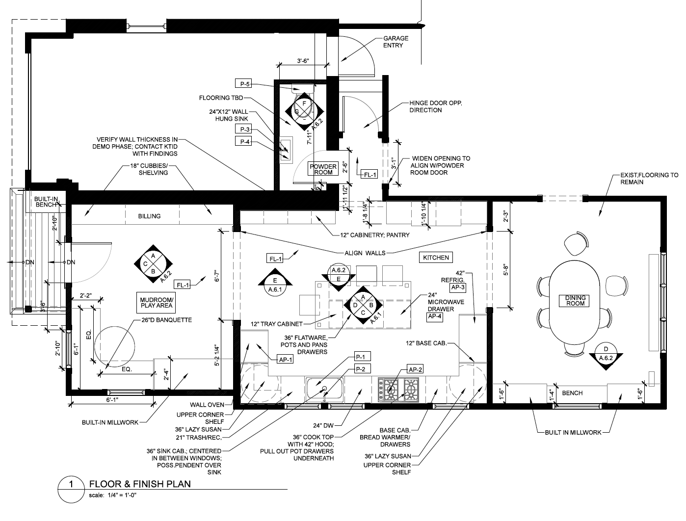
The existing floor plan was pretty typical for a 1920s colonial: lots of small rooms, a butler’s pantry separating the kitchen from the dining room, and a powder room off the hallway on the first floor. To achieve the open floor plan desired, we quickly realized that even though moving the powder room wasn’t part of the original plan, it was necessary in order to square off the kitchen properly and open up the dining room to the rest of the floo. This is where understanding the goals helps drive the design work, as the client didn’t ask to move the powder room, but once they understood the impact on the design, they agreed the move was critical.
The final floor plan opens up the house from front to back, allowing natural light and views across the whole space.
Design Development
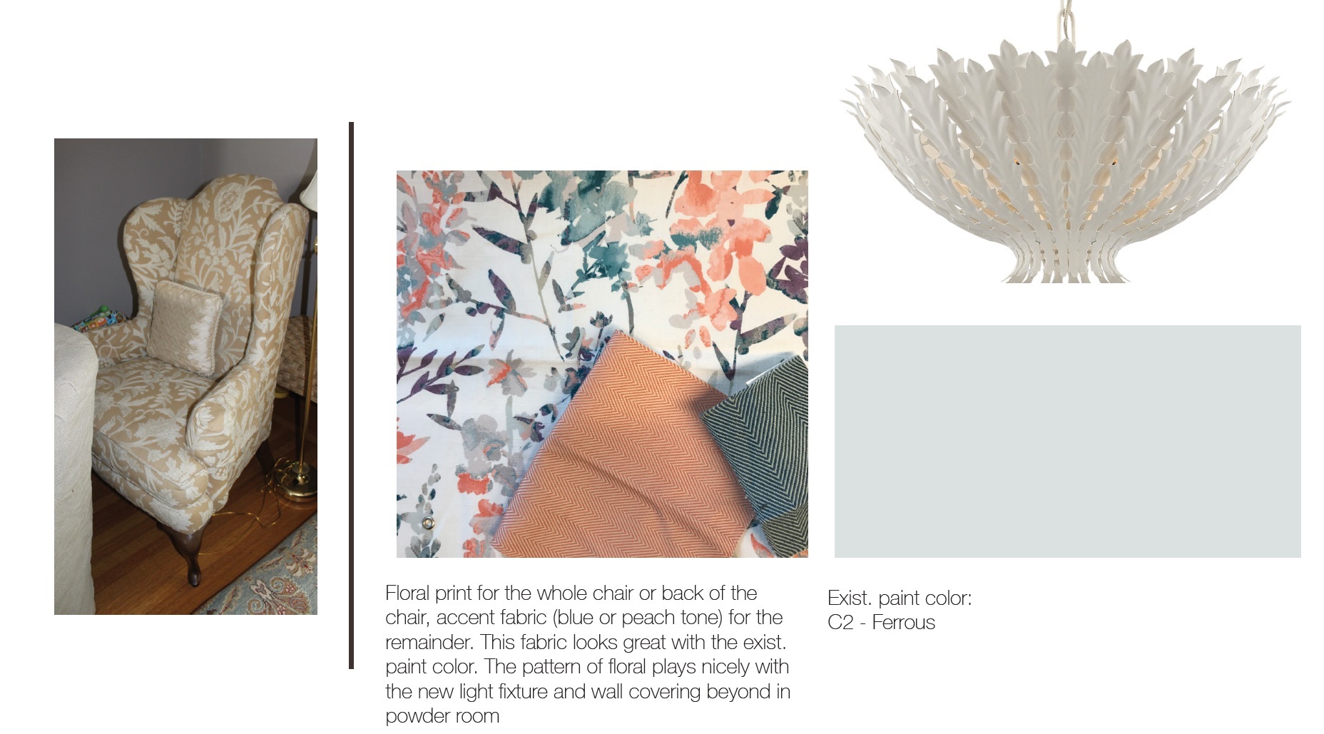
Once the floor plan is set, we begin fleshing out all of the components of the design, from cabinetry details to actual selections of lighting, colors, fixtures and furniture. With loads of visual communication, we ensure our client understands our design concepts as well as what the finished product will look like, using tools like photoshop to illustrate design options and why we may be recommending a certain approach.
A simple layout illustrates our ideas for the foyer area, where we repainted, added new lighting and refurbished existing furniture.
Construction Documents
Providing a road map for the builder is essential and the more detailed it is, the easier the construction is on everyone, the faster the project goes, the less questions. As we build these documents, we stumble on questions ourselves that we can answer before the construction begins. Drawing helps us work out small details, refine the design, understand what may come up later—it is our way of communicating with ourselves, with our clients and with our builders.
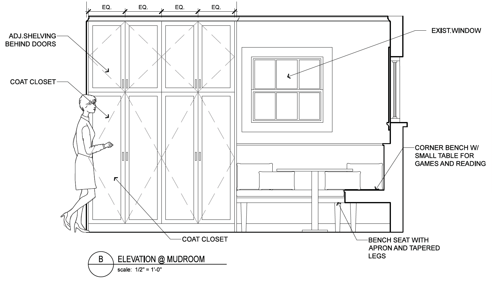
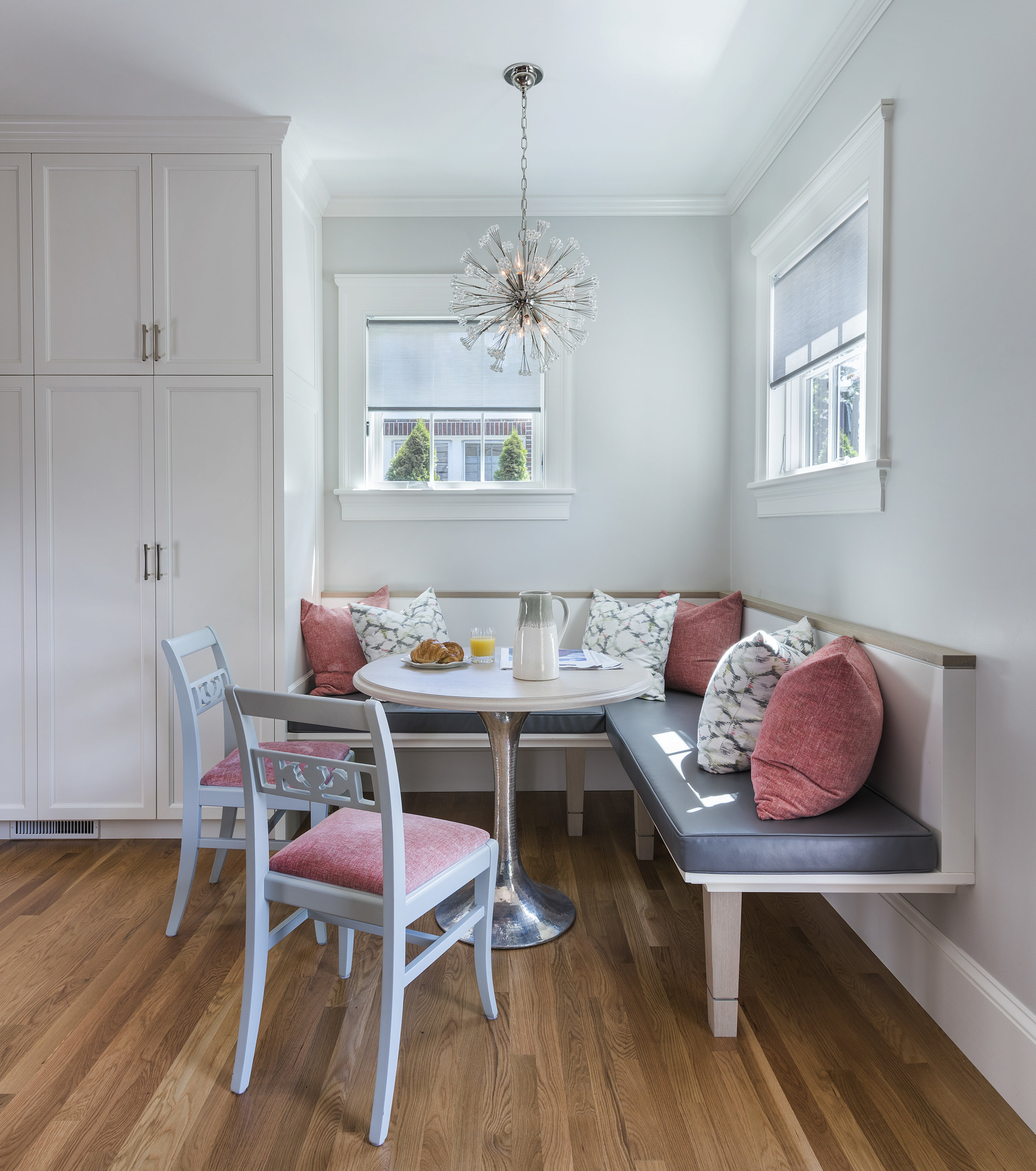
This interior elevation shows a new built-in banquette and the new cabinetry that it will seamlessly integrate into.
Construction Oversight
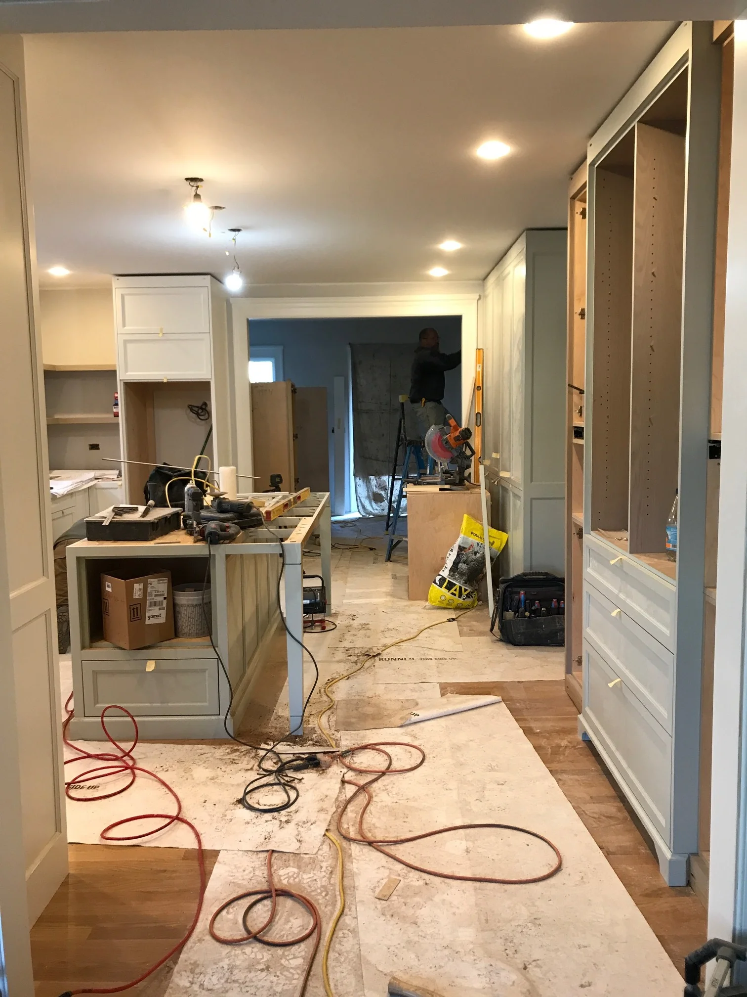
As with all of our projects, we work closely with the builder to ensure that every phase of the build is managed. Field decisions are required on every project and we make ourselves available to regularly visit the site and answer any questions that arise.
Regular site visits ensure the finished product meets the specifications and intent of the design.
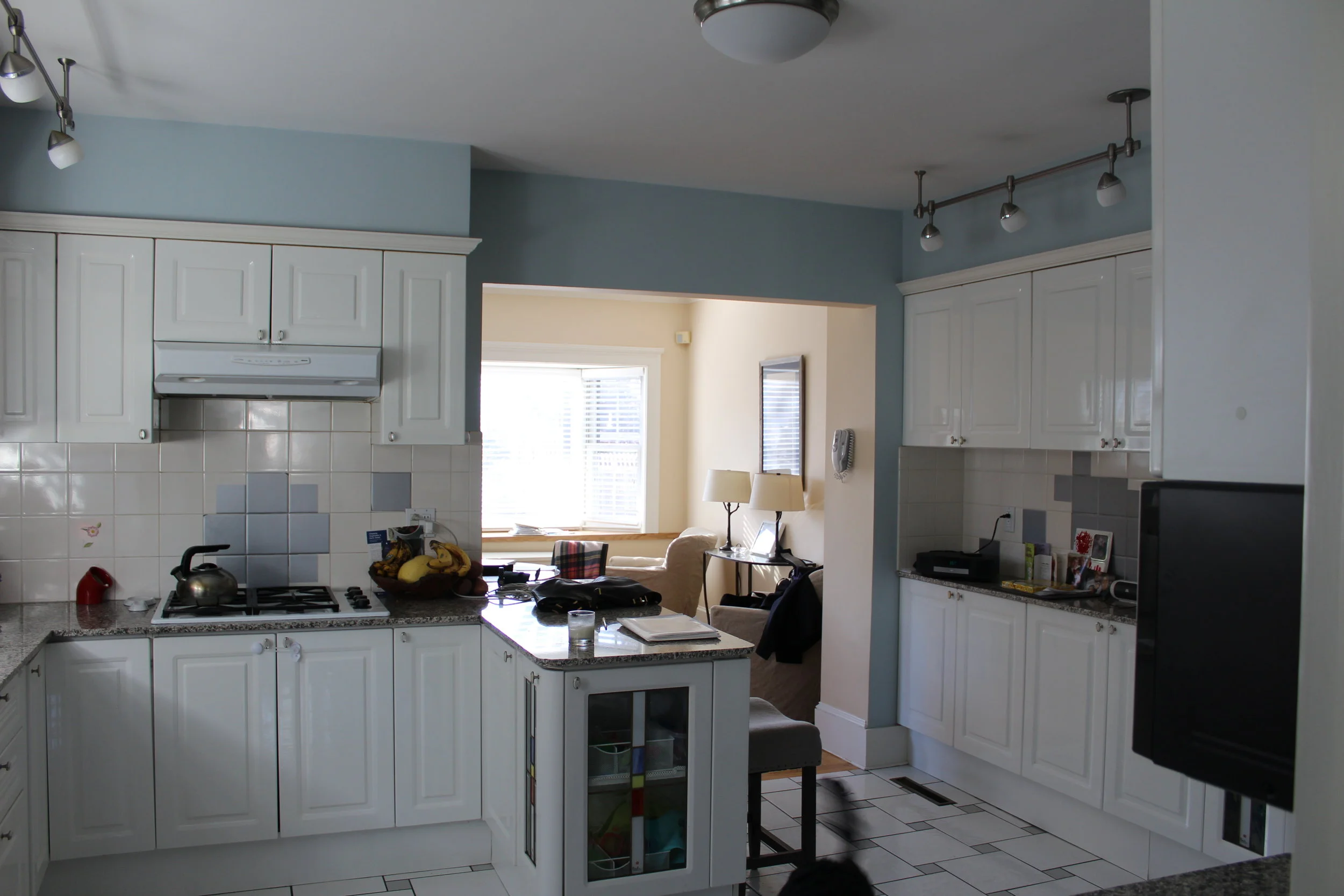
A closed-off kitchen adjacent to a room off the back of the house was dark, cluttered and claustrophobic.
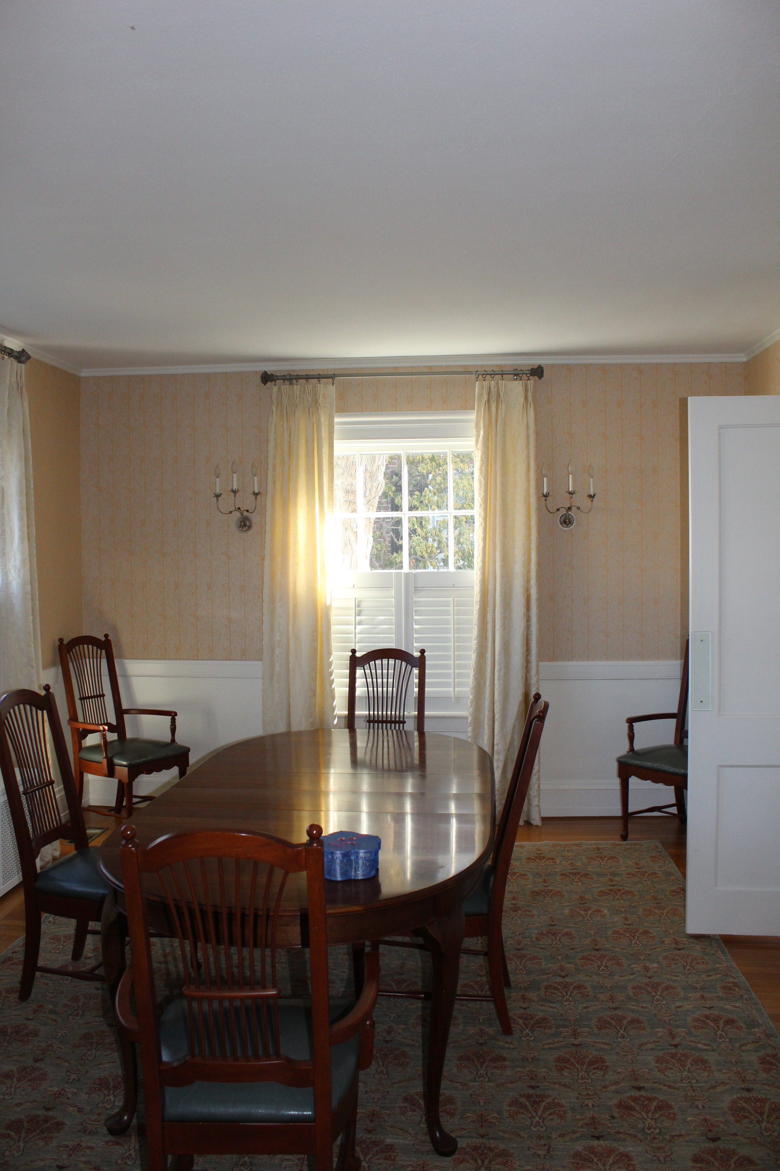
The dining room, full of windows, was far too dark for their liking and isolated from the rest of the first floor.
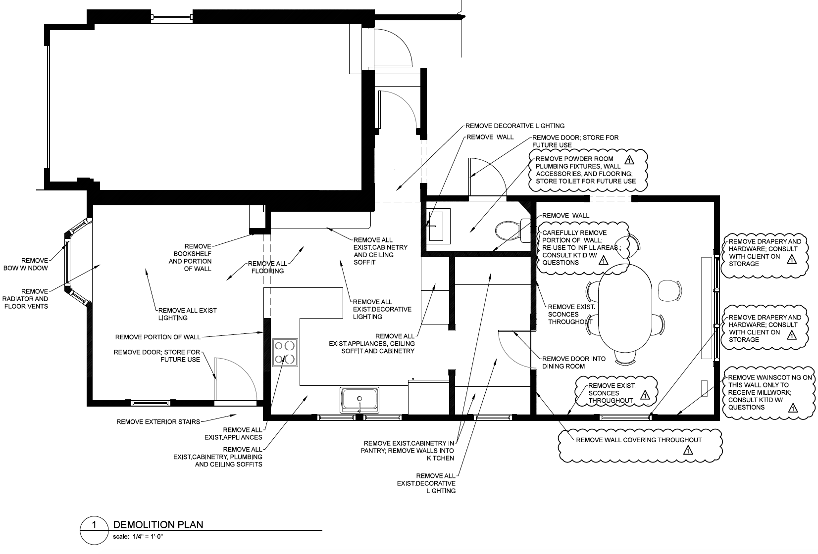
The demolition plan above shows the existing layout—a choppy rabbit warren of rooms that creates isolated spaces.
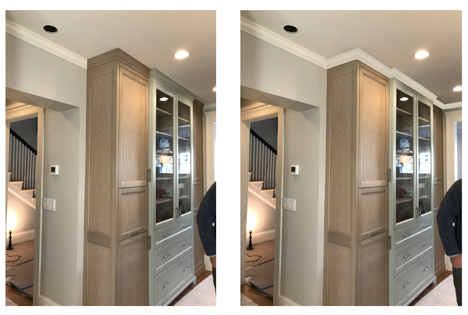
When the cabinetry began going in, this client was concerned that the crown molding on the cabinets did not match the crown molding in the rest of the kitchen. Photoshop renderings quickly helped them understand the difference.
The finished foyer, where we added lighting and accessories and repurposed furnishings from other parts of the house.
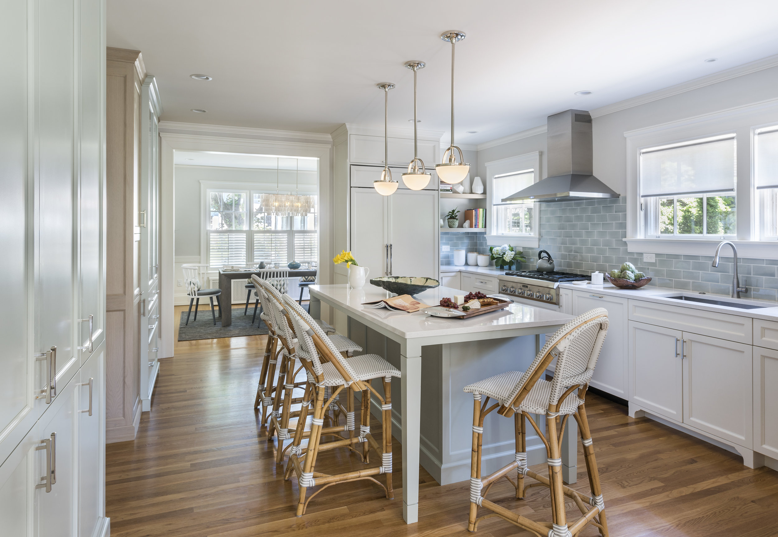
The finished product, thoughtfully designed for size, function, proportion and aesthetics, went together seamlessly for install.
Success
Nothing is more exciting to us than transforming lives. As Kate, the homeowner, told East Side Monthly magazine, the kitchen is one of her favorite spots: “It acts as the hub of the home. Our friends and family mean the world to us and we entertain often. We can dress the kitchen up or down and just as easily accommodate milk and mac-and-cheese at the island for a playdate for three-year-olds, or a charcuterie spread for grown-ups.” At KTID, we aim for impact, and our success is measured most by the positive impact our work has on the lives of our clients.

