Case Study: YOUR BLUE STORE
Six Weeks of Research
After visiting the existing BCBS stores, we spent six weeks interviewing employees from the CEO and other top executives, to store managers and sales associates—and even sat in the lobby and spoke with members themselves. We delved into research of healthcare and other types of service retail. We learned all we could about the needs of the store and the members. After compiling all of our findings, we set out to create a schematic design.
Our schematic plan had several major tenants that we incorporated into a diagram we called “your blue path.”
Design Development
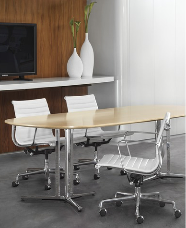
With a solid schematic design in place, we developed the design, focusing on branding the store with company colors, warmth, and a sense of home. Health is a personal, sensitive topic and far too often, medical facilities are cold and sterile, which was everything we did not want the store to feel. We proposed warm walnut wood accents, a clean bright white interior with colorful accents, various lounge and seating areas, and cozy, private meeting spaces to help members feel comfortable and at ease when discussing the intimate topic of their health. Simple three-dimensional views provided the client with a sense of the architecture of the space, conceptual images helped the client to visualize the ideas and specific furniture imagery gave them a sense of exactly what we were proposing.
A wireframe sketchup model illustrates spatial relationships.
This image helped guide the client to an understanding of the power of natural walnut to warm up a clean, modern space.
Construction Oversight
Finally, we worked closely with E.W. Burman, Inc. to make sure any questions that come up are answered in accordance with our ultimate design intent. Bringing a design to life requires consistent on-site supervision. We are in the field regularly to ensure that every decision made is one that reflects the best possible design.
Christine West, of KITE Architects and Andy Burman, of E.W. Burman, Inc., at a close to the finish line site meeting.
Collaboration
A project like Your Blue Store takes an enormous amount of collaboration, from client to design team to builder and everything in between. In the end, Rhode Island Monthly honored all of us with a 2018 Design Award. Check that out here and see more images from this project in our portfolio.
When Blue Cross Blue Shield RI approached us about designing a “flagship” retail store, we were thrilled with the challenge of doing something we’d never done before—”service retail.” We teamed up with Kite Architects and went straight to work on a six week discovery phase. And we consider that the key to our ultimate success. Even though our timeline for design delivery was tight, we took the time to learn everything we needed to know before we started any design work.
Between store visits and interviews, we learned that privacy and acoustics were major concerns at the existing stores, which informed design decisions we made at the new store.
Schematic Design
Equipped with in-depth knowledge, our efforts to diagram the operations and adjacencies into a schematic plan for the store came quickly. Major ideas were: multiple waiting areas, a pay station at the front desk, a dedicated staff room for employee administrative work, multiple meeting rooms to serve a variety of group sizes, one room for the nurse care associate and a large area for fitness and wellness classes.
Sketches like this one dive deeper into the details of store elements; in this case, we illustrate proposed meeting pods.
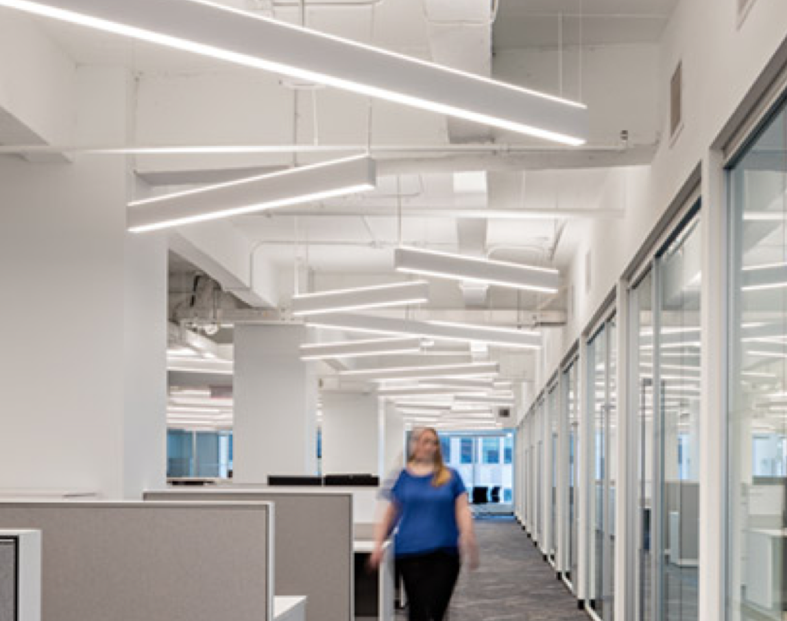
Illustration of a proposed lighting concept ensures the client gets a sense of how the finished space will look and feel.
Construction Documents
In the final phase of design, we pull all of the concepts into a set of documents that provides a road map for the builder. This is where we finalize every last detail, how things will be built, where every light is located, etc. Our detailed drawings allow the contractor to understand every intention within the design in order to properly execute the build out. From interior elevations to technical details, these documents create a way for all of the collaborators to remain on the same page to ensure the final product is as the design intended.
Interior elevations illustrate every detail of the custom millwork and graphics that will make the space come to life.
Grand Opening
A month into the opening of Your Blue Store, BCBSRI hosted a party to announce the store and celebrate its arrival to East Providence, Rhode Island. There, all the team members: the BCBSRI creative team, KITE Architects, KTID, E.W. Burman, city officials and members of the community came out to celebrate the grand opening of the store.
Christine West, Principal of KITE Architects, Philip Hawthorne, Creative Director for BCBSRI and Kelly Taylor celebrate at the grand opening.


